PETROLMAT II
Deliverables
- 400 UI assets
- 20 longer animations for user guidance (20-30 sec)
- 280 minor status indicator animations – dynamically rendered
- 1-1 full-screen animation for idle status
All the above are tailored for 8 oil companies following their respective brand guide.
Used tools
FigJam – flowcharts, mind mapping
Figma – wireframing, UI components
Cavalry – 2D vector animations
Affinity Designer – vector graphic assets
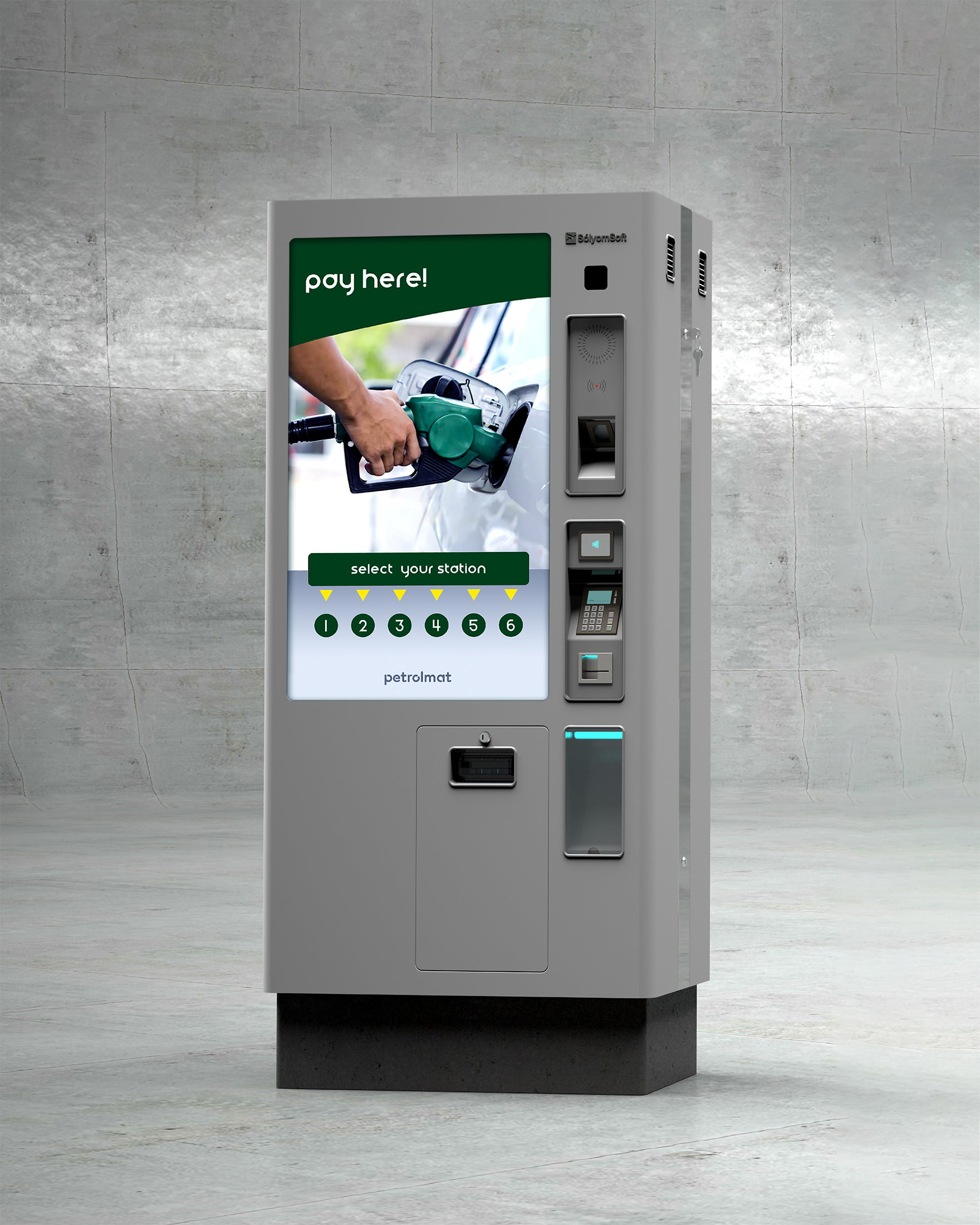
Petrolmat II concept art - credits: SólyomSoft

The Petrolmat II installed on site - OMV EuroTruck Edition
Provided materials
- User flow diagram,
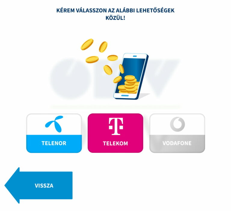
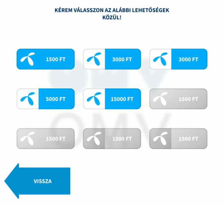
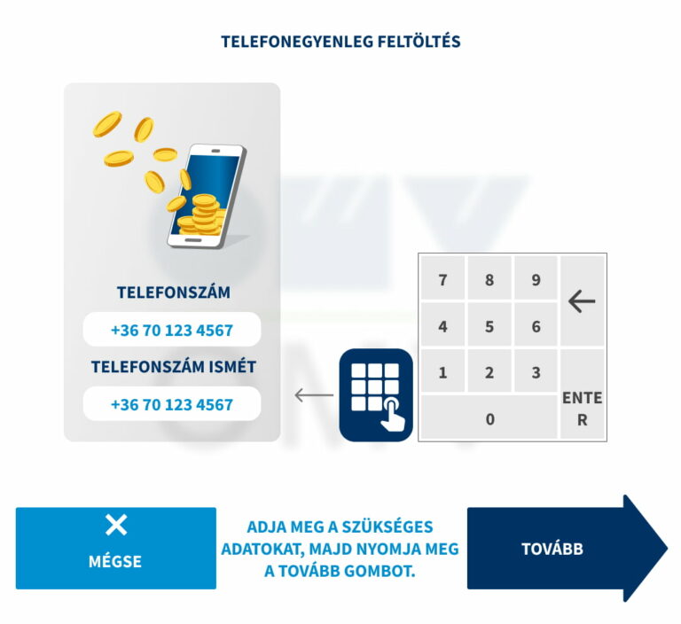
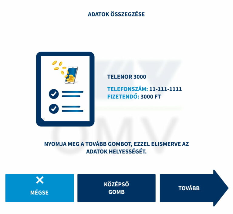
- Screenshots of the old UI,
- Branding materials (8 oil companies),
- Plenty of written documentation about the “what? why? when? “-s.
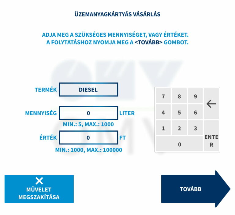
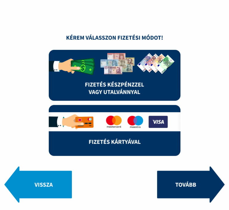
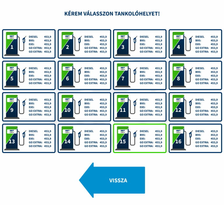
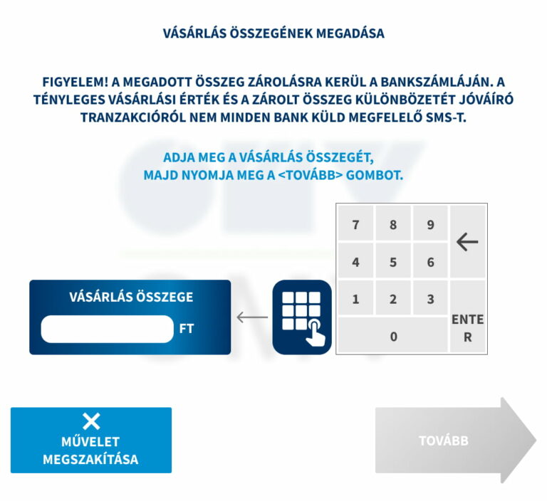
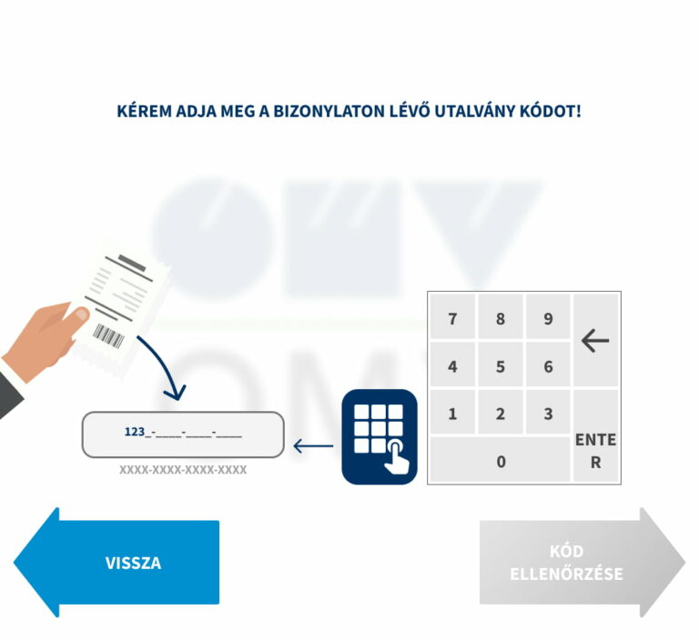
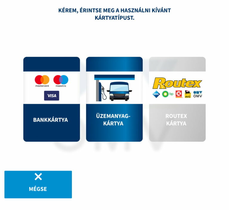
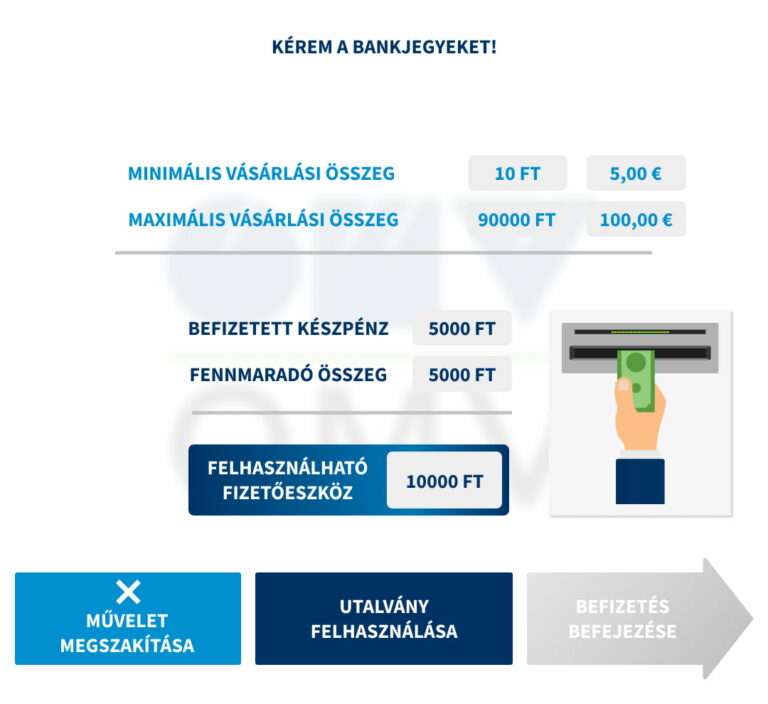
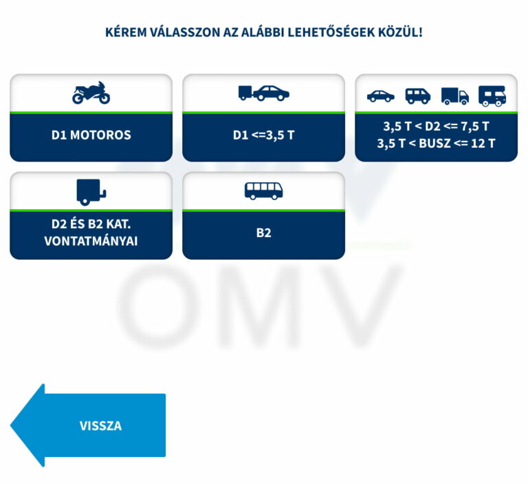
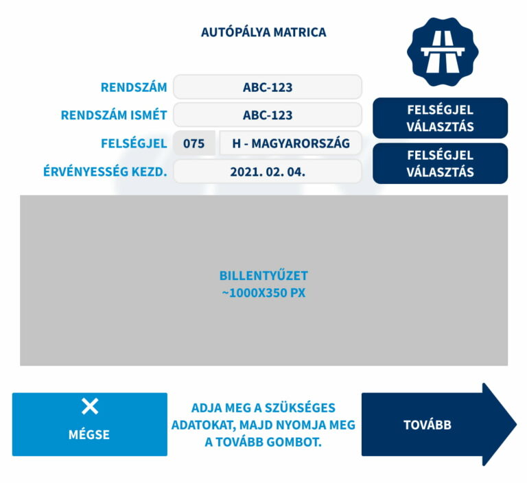
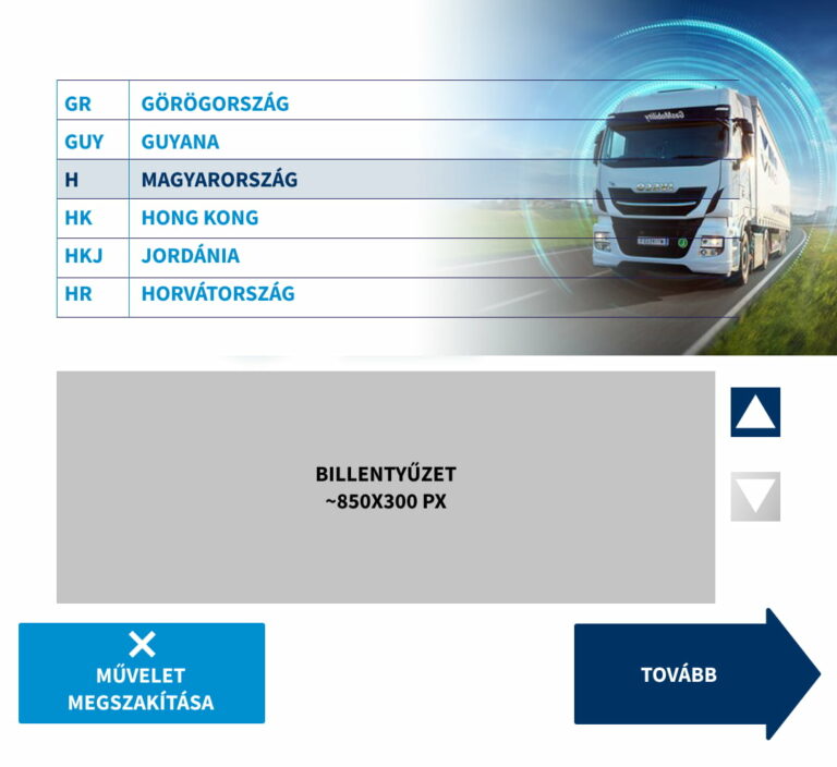
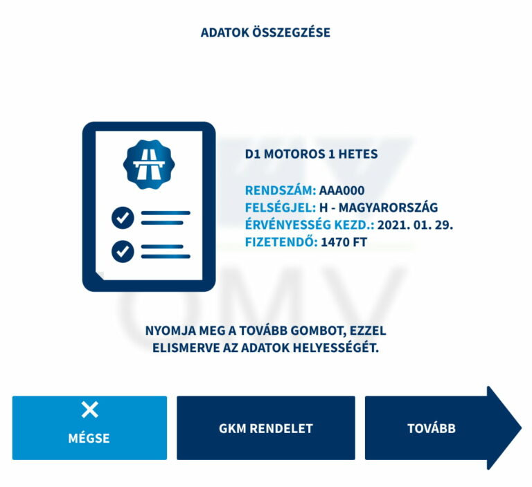
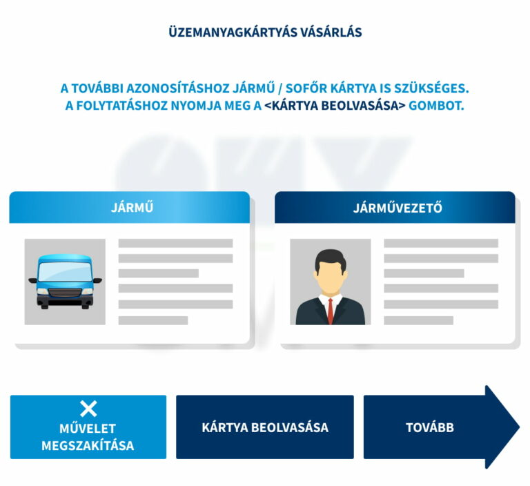
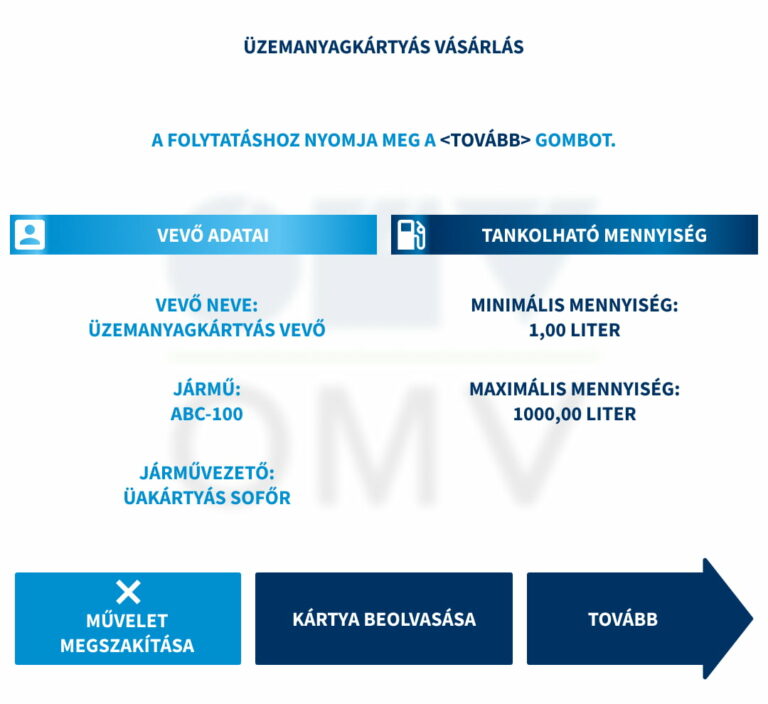
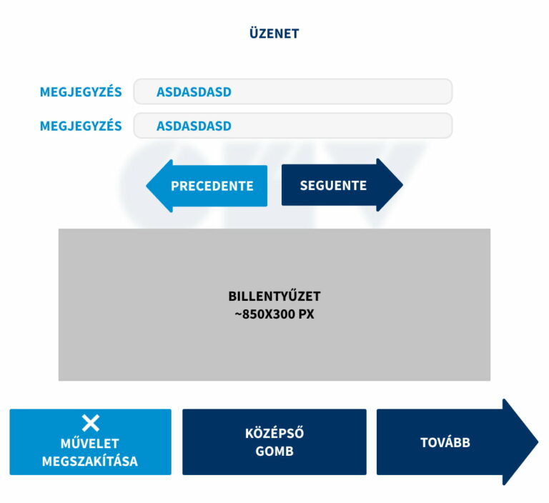
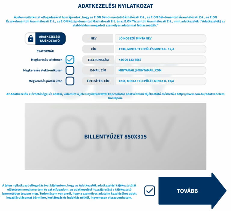
Sample screenshot of the old UI. - client provided materials


Sample screenshot of the old UI. - client provided materials
The brands
- AVIA
- ConOil
- MobilPetrol
- Szib-Ép
- SólyomSoft
- OMV
- OMV EuroTruck
- OIL!
UI challenges, design constraints
The Petrolmat software is not a web application. It was written in Delphi several years ago. To avoid changing existing parts, we had to cut corners in design.
Deliverable UI assets were .png files without text (labels). Empty rectangles in most cases. The button labels (strings) are generated by the software, placing above them visually.
I tailored the UI for 8 brand with the support of 4 languages in mind. The process was to create one prototype UI and alter it for 7 other version. The following constraints and challenges emerged:
- One font file per UI. Hard to keep visual hierarchy when all texts are in regular, semi-bold or bold.
- The color of a text string was defined from a fixed array of colors (global colors).
- Example: color-0: primary, color-1: secondary, color-2: accent. If a text had color-0 applied in UI 1, it will have color-0 applied on UI 2 to 8 as well. This was a challenge when the primary color had insufficient contrast ratio with white (like the yellow main color in MobilPetrol)
- Fixed container dimensions (.png images)
- Example: 4 language variations -> same button label has different text lengths -> overflow issues
- Solution: Usually I tested the text with the longest strings (German and Italian). Avoiding overflow issues were crucial.
- Fixed font sizes.
- Example: AVIA uses Helvetica Neue. OMV uses Source Sans Pro. A text in 20px will have different dimensions depending on the font family (another possible overflow issue).
- Solution: FontForge, scale down / up the set of glyphs with kerning etc. in mind.
The layout
The screen is a 43” touch display, 1920 x 1080 px. Fixed subdivisions from top to bottom:
- Upper video – 1080 x 304 px
- Middle interactive part – 1080 x 990 px
- Lower video – 1080 x 606 px
- Bottom information row – 1080 x 20px
My responsibilities were the middle interactive part’s UI and the lower video part’s animations.
The layout
The screen is a 43” touch display, 1920 x 1080 px. Fixed subdivisions from top to bottom:
- Upper video – 1080 x 304 px
- Middle interactive part – 1080 x 990 px
- Lower video – 1080 x 606 px
- Bottom information row – 1080 x 20px

My responsibilities were the middle interactive part’s UI and the lower video part’s animations.
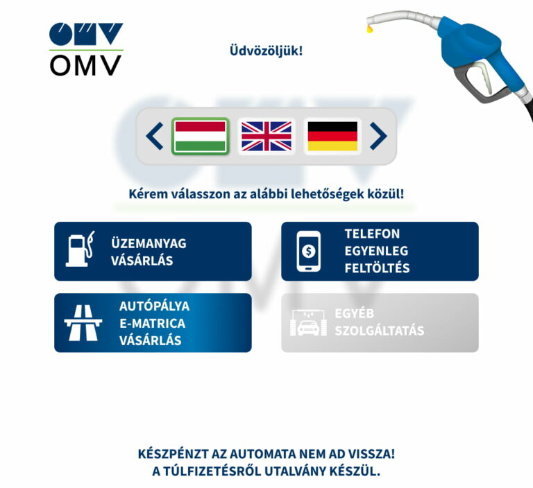
Petrolmat II main menu in 8 different branding schemes.
2D Animation
Main goals
- Provide guidance (hand pushing buttons, choosing from products, or typing in details)
- Inform the customer (status indicator animations – indicate which spots are free / begin fueling / occupied)
- Elevate the overall experience visually.
Constraints
- Be suitable for 4 language – no text except numbers or common expressions (example: pay with card)
Deliverables - per UI pack
- 20 longer (20-30 sec) animations to guide the user through the process and interaction.
- 280 minor status indicators – Cavalry’s Dynamic Rendering function, batch creating them from a single Google Spreadsheet.
- 1 full-screen animation for idle status.
Challenges
- Opposed to the UI, animations are hard to design with iterating. You need a clear plan, define the graphic assets, make it compatible with the animation software – a lot of pre-work with Illustrator or Affinity Designer.
- An animation may “look nice” standalone, but it should not distract the user from the main part of the screen.
- The animation starts when the new screen loads, and repeats indefinetly, until the user navigates further / beyond. You supposed to serve a consistent experience across all the screens, wether the user goes through the process fast or slow. Every animation should have the same, fixed, common background.

2D animation thought process. I listed the relevant screenshots together, noted down the human interaction behind each screen, and what should the corresponding animation be about.
Animation example: voucher
Machine operating principle
- HUF and EUR support without direct cash payback.
- If the filling prematurely ends, the OPT prints a voucher for the remaining sum.
Animation
- The voucher has a code and a barcode on it. It can be used in 2 ways:
- Scan the barcode on the top-right of the terminal
- Type the code in manually
The animation aims to provide this information, without a single line of text used.
The animation aims to provide this information, without a single line of text used.
Animation example: status indicators
Machine operating principle
- Capable of operating up to 12 pumps.
- Knows when a spot is free, occupied, or a customer should start fueling on a certain dispenser.
- This information needed to be shown on the main screen.
Animation
- In the example, the wawing guy tells the customer to start the fueling process.
- Due to the number of variable assets:
- 3 status,
- 4 languages,
- 12 spots,
- 2 sides (left / right),
- 8 brands,
2304 status indicator animations in total. This has been achieved via Cavalry’s dynamic rendering function, swapping assets and loading text data (numbers and subtitles) from a Google Spreadsheet.
Status indicator animations: start the fueling process – the customer completed the purchase and selected a dispenser.


